- Rank On YouTube
- Posts
- Thumbnail psychology 101
Thumbnail psychology 101
Stop overcomplicating it
Presley Milton
September 12, 2025
We’re in an epidemic of bad thumbnails.
I see way to many people reusing stuff that worked 4 years ago without understanding WHY it worked…
Using random, insignificant numbers like “$1,000,000” in their designs…
And ultimately just failing to create stuff that drives clicks.
Rather than making this a long winded rant email, I’m going to summarize my thumbnail philosophy in one phrase:
Think of your thumbnail “space” as if it were a “;” sign; you have the opportunity to communicate whatever you had to leave out of the title because of length.
With this in mind, you should be using your thumbnails to COMPLIMENT the text in our title, NOT just to repeat the same exact phrase.
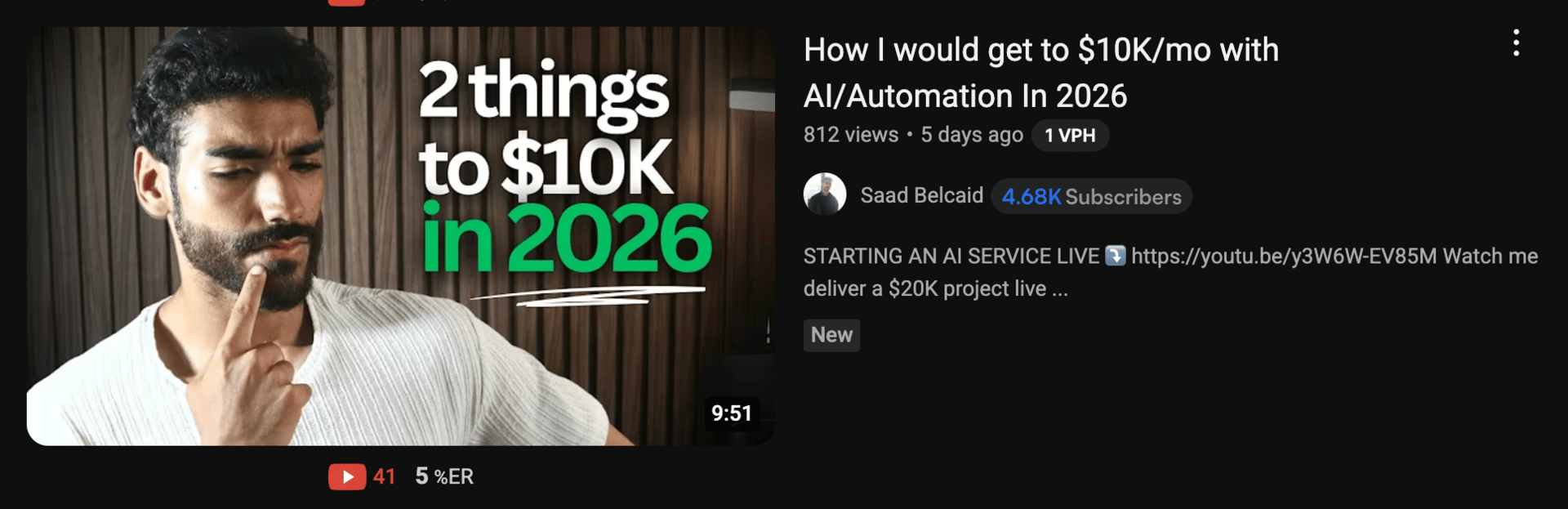
Redundancy in title/thumbnail
This is a totally random example I pulled from my YouTube recommended page but notice how the thumbnail text doesn’t “strengthen” the title at all?
It’s just the same text moved over to the thumbnail background.
This doesn’t:
Build any additional curiosity
Hint at the mechanism/strategy he’s going to be teaching
Add a “condition” to differentiate himself (for example, “only takes 30 min”)
With that out of the way, let me give you some examples of EFFECTIVE thumbnails we’ve created for clients:
Example 1: Vague hinting with images
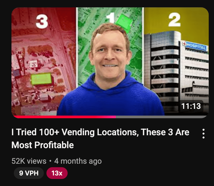
This is a super simple one, but gets the job done.
What we’re doing here is “half-answering” or “half-solving” the mystery posed in the title, without giving it away entirely.
By context clues one can assume that one of the 3 best locations is some kind of hospital or urgent care…
But the other 2 locations are indistinguishable and hard to guess.
This creates even MORE incentive for the viewer to find out what the remaining locations are because mentally they feel like they’re already 33% there.
Example 2: Social proof bomb

Here we’re taking advantage of the extra space by adding in supporting context about WHY the creator is qualified to speak on said subject in the title.
On top of the “proof” of making $150k/mo, we also create intrigue by adding in the fact that the “government pays him” which implies that the business model is low-risk.
See how this works better than just putting “step by step” in the thumbnail text or a bunch of meaningless icons?
Example 3: Intentional contradiction/paradox

This is a thumbnail we made for a former client that I absolutely love.
The text in the thumbnail DIRECTLY contradicts the message in the title and creates a ton of curiosity for the viewer.
Even though it sounds nonsensical at first, the video delivers on this promise as he explains that being overly obsessed with outcomes will make you an unprofitable trader.
The packaging is bold enough to get someone to watch, but isn’t pure “clickbait” since the nuance is properly explained.
I can go on about this topic for a while but this write up should give you 80% of what you need to make better thumbnails.
It’s been way too long since I’ve written on here, let me know what you’d like me to cover next.
-Presley
Work With Us
The Clip Curator: Our DFY YouTube + ads agency for B2B service providers, coaches, and consultants
Reply